Google Data Studio is a data visualization tool that helps you transform raw data into clear and easy-to-understand reports. By utilizing the concept of data visualization, you can present information in the form of informative interactive dashboards.
Through the various features available, you can also understand the function of Google Data Studio to monitor business performance, marketing activities, and website analytics more effectively. This article will discuss how this tool works and its benefits in helping the data analysis process become faster, more accurate, and easier to present.
What Is Google Data Studio?
Google Data Studio (which since 2022 has been renamed Google Looker Studio) is a business intelligence (BI) and data visualization tool provided by Google for free.
This platform helps users transform raw data into reports and interactive dashboards that are easy to understand. In the digital data analytics field, this tool plays an important role because it can convert complex data into information that is easier to interpret.
Many companies utilize this platform because of several advantages that support data analysis activities:
Free of charge:
Users can utilize various visualization and analysis features without paying subscription fees like many other business intelligence tools.
Easy to use:
Its interface is designed intuitively with drag-and-drop features and various ready-to-use templates.
Real-time collaboration:
Reports can be shared with team members and edited simultaneously, similar to how Google Docs works.
Flexible display customization:
Users can adjust report designs according to their needs.
Simplifies data access for stakeholders:
The platform makes it easier for stakeholders to access important data without requiring complex technical skills.
Understanding Google Data Studio in the Google Platform Ecosystem
Google first developed this tool as part of the Analytics 360 Suite to help organizations access and understand data more easily.
The platform can connect with various major Google data sources to produce more comprehensive analysis. This integration helps users monitor business and marketing performance within a unified dashboard through connections with:
Google Analytics:
Google Data Studio displays this data in more flexible visual formats through interactive dashboards. Users can arrange graphs, tables, and custom reports that are more detailed than the default Analytics interface.
Google Ads:
Data such as the number of clicks, conversions, and marketing strategy effectiveness can be displayed in easy-to-analyze charts. The system can even help calculate ROI (Return on Investment) in a more structured way.
Google Sheets:
The system allows users to display data stored in spreadsheets directly within reports. Every change made to rows or columns in Sheets will automatically update on the dashboard in real time.
The dashboard in this platform works by transforming raw data into easy-to-understand visualizations through the following processes:
- Data Transformation
- Automatic Updates
- Interactive Visualization
- Real-Time Collaboration
- Template Usage
Functions of Google Data Studio for Data Analysis
Here are several Google Data Studio functions that help support the data analysis process:
Transform Complex Data into Easy-to-Understand Visuals:
This tool helps data analysts present large amounts of data in visual formats that are easier to interpret.
Create Real-Time Reporting Dashboards:
Reports can be automatically updated according to changes that occur in the data source.
Combine Multiple Data Sources in One Report:
This integration includes various Google services such as Google Analytics, Google Ads, YouTube, and BigQuery. Users can also connect it with other platforms such as Facebook Ads, LinkedIn, SQL databases, and CSV files.
Another important feature available is data blending. This feature allows users to combine data from multiple sources simultaneously into a single chart or table.
The merging process is usually based on the same key column, such as date, campaign name, or a specific ID.
Uses of Google Data Studio for Business and Digital Marketing
Through this platform, marketing teams can review the effectiveness of digital campaigns and determine whether marketing targets have been achieved through reports that are updated in real time.
They can utilize its functions such as:
Traffic and User Behavior Analysis:
Within the digital marketing ecosystem, this platform plays an important role in visualizing data from Google Analytics to understand website traffic and user behavior.
Supports Data-Driven Decision Making:
In practice, this platform also functions as a business intelligence tool that transforms raw data into visual narratives that are easier for different stakeholders within a company to understand.
This approach makes the analysis process more efficient because the system can automatically calculate and update metrics whenever the data changes.
Benefits of Google Data Studio in Report Management
Various widget options are available to support this process, such as heat graphs, pie charts, time series charts, and scatter charts. As a result, reports become more engaging when presented to teams or stakeholders.
Some benefits include:
Automated reports without manual updates:
Every change in the data source will automatically update the report without requiring manual editing.
Team collaboration in one dashboard:
The platform supports team collaboration through a sharing system similar to Google Docs. With this feature, multiple team members can work on the same report simultaneously.
Time efficiency in data analysis:
Users can utilize various ready-made templates available for different industries, including e-commerce. These templates help speed up report creation without starting from scratch.
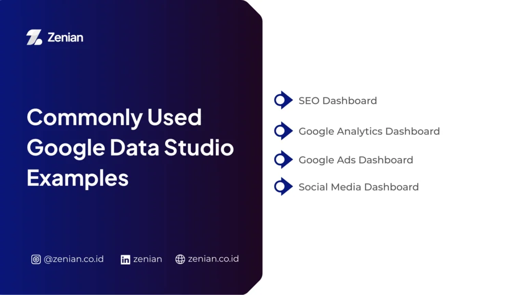
Examples of Google Data Studio Dashboards Commonly Used
With interactive displays, analysts can quickly monitor data changes and make information-based decisions. Below are some dashboard examples commonly used in business and digital marketing analysis.
1. SEO Dashboard
An SEO dashboard helps website managers monitor and analyze search engine optimization performance more systematically. With clear data visualization, marketing teams can evaluate content strategies and discover opportunities to increase organic traffic.
Information commonly displayed in this dashboard includes:
Traffic Data and Page Performance:
The dashboard can connect with Google Search Console to display clicks, impressions, and page performance in search engines.
Keyword Ranking:
Integration with keyword tracking tools such as Keyword Ranking Tracker allows analysts to monitor keyword positions in search results and evaluate SEO strategy effectiveness.
Technical SEO Audit:
The dashboard is also often used to monitor technical metrics such as crawl performance, indexing status, and other indicators affecting a website’s organic visibility.
2. Google Analytics Dashboard
This dashboard is one of the most popular uses because it can present visitor behavior data visually and in an easy-to-understand format.
Direct integration with Google Analytics helps marketing teams quickly identify user interaction patterns.
Common analyses available include:
User Behavior Analysis:
Templates such as behavior overview display how visitors interact with website pages, from the number of sessions to visit duration.
Traffic Sources:
The dashboard shows visitor origins such as organic search, social media, or referrals. This data is usually visualized through pie charts, graphs, or tables.
Interactive Metrics:
The Date Range Selector feature allows users to compare data across certain time periods to observe traffic increase or decline trends.
3. Google Ads Dashboard
Many businesses use this dashboard to monitor digital advertising campaign performance in a more structured way. The visual information helps marketing teams evaluate advertising strategies more easily.
Some key metrics typically monitored include:
Ad Performance Monitoring:
The dashboard displays metrics such as clicks, impressions, and cost per click to help evaluate campaign success.
Advertising KPI and ROI:
Through the calculated fields feature, users can automatically calculate metrics such as Return on Ad Spend (RoAS), allowing faster evaluation of advertising budgets.
Automatic Data Updates:
The reporting system is dynamic, meaning every change in the Google Ads account will immediately appear on the dashboard.
4. Social Media Dashboard
A social media dashboard allows marketers to combine data from multiple platforms into a single integrated report display. This approach enables marketing teams to understand overall digital campaign performance.
Analyses usually included in this dashboard are:
Engagement Analysis:
Data from platforms such as YouTube Analytics or Meta Ads (Facebook) can be used to monitor interactions such as likes, comments, and shares.
Data Blending:
This feature allows users to combine multiple data sources so campaign performance across platforms can be compared within one dashboard.
Integrated Reports:
Data from non-Google platforms such as Facebook can first be inserted through Google Sheets and then visualized as interactive charts for easier analysis.
How to Create Reports in Google Data Studio
To get started, open the official Looker Studio website at lookerstudio.google.com and log in using your Google account.
After successfully logging in, select the Create menu and click Report to create a new report.
You can start from Blank Report or use an available Template. Continue with the following three steps.
1. Connect Data Sources
The first step in creating a report is connecting the platform with raw data sources so the system can process the information to be analyzed.
Choosing a Connector:
When creating a new report, the system will display the Add Data option. The platform provides more than 500 data sources.
Authorizing Data Access:
Select the data source you want to use and grant access permission if the system requests it. Then click Connect or Add to integrate the data into the report.
Combining Data (Data Blending):
If you use several different data sources, the data blending feature helps merge them into one visualization.
2. Create Data Visualizations
After the data is connected, you can start designing visual displays so the information becomes easier to understand and analyze.
Add Charts:
Use the Add a chart menu to insert visual elements into the report. You can choose various chart types such as time series, bar charts, pie charts, geo maps, scorecards, and heat graphs.
Customize Report Display:
The platform allows you to configure visual elements such as fonts, colors, themes, chart sizes, and page layouts.
Add Interactive Elements:
Use the Add a control menu to add interactive features. Report users can filter data by location, category, or choose specific time periods using the date range selector.
Create Additional Metrics (Calculated Fields):
You can also create custom calculations using the calculated fields feature.
3. Share Reports with Teams or Clients
One of the main advantages of this platform is its real-time collaboration capability, similar to how Google Docs works. This feature makes it easier for teams to view, edit, and update reports together.
Use the Share Menu:
Click the Share button located at the top-right corner of the report dashboard.
Invite Users:
Enter the Gmail addresses of colleagues or clients who should have access to the report.
Set Permissions:
You can determine user access rights such as Viewer (can only view the report) or Editor (can edit and manage the report).
You can also share reports using the following methods:
Get Report Link: copy the report link to share directly.
Schedule Email Delivery: automatically send reports via email at certain intervals.
Embed Report: embed the interactive report on a website or blog page using the following HTML code:
<iframe src="URL_REPORT" width="800" height="600"></iframe>
Download Report: download the report as a file such as PDF for presentation or documentation purposes.
Want Easier and More Measurable SEO Data Analysis?
In conclusion, using data dashboards helps businesses understand digital strategy performance more clearly and measurably. If you want to manage SEO data analysis more effectively, you can utilize professional services such as Zenian.
Through a data-driven strategy approach and integrated Search Engine Optimization (SEO) services, PT Zenian Digital Lab helps increase organic traffic while supporting sustainable business growth. Consult now!
Read Too: Understanding Google Colaboratory: Functions and Features